Today I visited Yorkshire Sculpture park to see the Henry Moore
sculptures and exhibit, I really enjoyed looking at the skills pieces
although not to my last I loved walking round and finding a new
sculpture at every cornet the piece that caught my eye most was
Julain Opie's Running Horse I really loved the animation and did
not expect to see such outside in the park.
Saturday, 28 February 2015
Thursday, 26 February 2015
OUGD402 Brief 2 - My logo
OUGD402 Brief 1 - Sara Pope Exhibition
I stumbled across this exhibit at munro house while looking
for inspiration for a studio brief, I really enjoyed visiting and
browsing this work although I didn't feel it relevant to my studio
work and felt this would be the place to show it, Pope's work is
pop arty and glamorous I really enjoyed looking at her work
its not quite my style but I appreciate her work. I love the use
of tone, colour and sheen and especially the glitter!
Here are a few snaps from the exhibit...
OUGD402 Brief 2 - Business Cards
To exaggerate my logo design created some square business
cards. Im really impressed with the outcome and feel re-branding
myself has been really eye opening.
If given the chance i'd like to utilise book binding's corner cutter
to create round edges I experimented this by doing it by hand and
feel it would look perfect for my approachable business cards.
Here is my business card grid its pretty much the logo grid with a
extra width round the edge for white space.
Friday, 13 February 2015
OUGD402 Photography Lighting Induction
Today we learned how to use lightening to take professional
style photos of our work to be used for our professional practice.
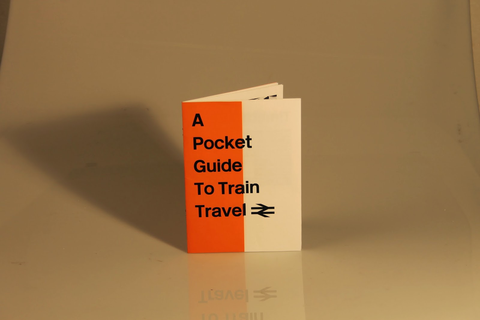
Here are a small example of my photo's.
style photos of our work to be used for our professional practice.
Here are a small example of my photo's.
In pairs we experimented with different lighting equipment
adding umbrellas to create softer light etc. We played with aperture
and placement. We noticed our images looked rather yellow to
remove this we took a picture of grey card to set the camera
to see in that colour adding a better white balance.
OUGD402 Brief 2 - Type decisions
Although I like the look of my logo as it is I think without
experimenting with different typefaces I will not know if
it is the right typeface to show me as at the moment it seems
shy and quite and I am the opposite.
I've also so far looked at using CMYK, as my colour scheme
because they are separated into 4. Not only this I'm really
enthusiastic about print and print processes. Im also the
daughter of a printer so it links quite well to me personally
as well as professionally.
 |
| Helvetica Light - Although clean and appealing it is not speaking out my personality needs to be bold and adventurous. |
 |
| Bree - Really love this boldness really stands out and has character similar to how my personality is. |
 |
| Futura - Love the boldness and defined edges to simply put it, its "edgy" this is my favourite its both loud, eye catching and modern. |
 |
| Futura Condensed - Although similar characteristics it gives the impression of height and I am certainly not tall. This is not the one for me. |
OUGD402 Brief 2 - Digital Developments
Digital Developments
I've tried out a few variations of my design playing with
the soft and hard edges alongside colour etc.
I've tried out a few variations of my design playing with
the soft and hard edges alongside colour etc.
 |
| Curved edged boxes I like this but I don't like the centre. |
 |
| Ive taken out the middle and re-placed it with a straight edged centre. I prefer this but something is not quite expressing my idea as well. The boxed look too parcel like. |
Subscribe to:
Comments (Atom)


