Thursday, 10 December 2015

OUGD502 Task 2 - One Day Brief - I love HORT

The brief

"Launched in 1994 (originally as Eikes Grafischer Hort), Berlin studio Hort initially developed a sizeable reputation for its music industry-based design projects. Since then it has demonstrated both versatility and an approach to experimentation through the juggling of big client work (Nike, Volkswagen, The New York Times) and equally fascinating self-initiated output.
Your brief today is to produce a piece of work exclusively for Hort. Level 5’s one day creations will then be packed off to Germany to inform and excite Hort’s founder Eike König ahead of the LCABAGD trip to Berlin. On receipt of these seductive six-hour wonders, a number of students booked on that trip will be handpicked for a visit to Hort’s studio. For those students that are not travelling to Berlin in March, this is still an opportunity to have your work seen by a highly respected designer and his team: hopefully something that you can build on in terms of your own personal and professional development.
As for what you will make? Do some research. Develop a concept. Have some fun. Your work can be produced using any medium or technique. Both digital and physical outputs can be devised but you are asked to ensure that each offering is then submitted as a 300dpi image that can be reproduced on a 250mm x 176mm page. These digital files will be collected at the end of the day. It is also suggested that you should blog this day’s work to make full use of any potential exposure"
After looking through the website I felt the studio was really experimental and collage influenced so I wanted create something completely wacky that represent both my style and theirs, so to do this I experimented with Collages and ink. Using my morning to research into HORT I then dedicated the afternoon to creating...

My design idea was based around Leeds and my fave things along side the fact we are visiting Berlin!


My final piece I scanned into the computer to be sent to HORT my design is supposed to come across as humorous the plane symbolises us! and the rest is inspired by Leeds.

My final Res.


Although this was a really short brief I enjoyed this task and it was really interesting to see my outcome as it is something completely out of my comfort zone. I don't love it but I feel it is on its way and I am proud of my efforts.


Sunday, 29 November 2015

OUGD502 Brief 2 - Learning to use Colour Management/Cleaning a Machine

Cleaning the Durst P10

At work this week I am doing training to learn how to use a 
printer this weekend I learnt how to clean the printing heads
for a Durst P10 this printer has approx 24 heads it prints in
4 colours. It is possible to print more than 4 such as Light, 
Cyan and Magenta and also white.
A head consists of 4 shoots this is where the ink is printed from
the ink is pushed through the shoots to create the tiniest of 
bubbles of which is then suspended in air - in order for
this to work the ink must be heated (In the reservoir) otherwise
it won't print. At the wrong temperature the ink can be either
too thin or too thick producing bad prints. If the machine has been
stood not in production for a long time it is necessary to do what
they call a 'purge' this reheats the ink to optimum temprature and 
releases the ink in the 4 shoots into a waste bucket located under
the machine when you've done this you have to open up the
machine to allow access to the heads you must then wipe the 
head clean with a special cloth removing the ink as best of possible 
sometimes the ink can be very dry and will need a chemical to
remove it. Once done the machine can be tested to print my first
test came out very wavy which suggested the machine needed a
further clean, in order to print quality the lines must be as straight
as possible this can sometimes be corrected by printing a dummy 
image and then re trying the test they keep the tests at work to 
keep the machine in warranty.

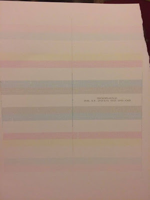
The Durst P10 is relatively small but for example if the same
testing process was done on a much larger printer the test sheet
can be over a metre long - the test sheet is an image of all the
heads in the image shown there is more than 3x the amount
of heads on the 'Inca'


Colour Management

Basically when we as designers want to use a pantone colour
each printer will recognise the pantone colour and create a 
4 colour separation with a percentage of colour, your artwork will
be sent through a colour management programme such as a GMG 
which is a series of settings so the printer can print the pantone colour
with correct settings usually created by the printer. Every printer
uses different inks so this can pose a problem when creating consistency
this is why Panotone books are necessary in a printers, this weekend
I corrected around 20 pantone colours to print exactly the same as
the pantone colour it says (On different machines). To do this you 
must painstakingly print many copies and adjust the percentages until 
perfect otherwise all machines will print a different version of the colour 
you then cannot guarantee consistency which is important for campaigns. 
Although some colours will be set up in one machine they may not be in
others it can take hours and even days to correct colours - The colours
I corrected were for a waitress campaign this took me 4 hours and still
3 colours still need to be amended. 

For example if the colour is too light compared to the pantone swatch you
could add a percentage of black? you must always remember how much
you add the calculation as there is a chance you will need to reset it back 
to the colour, although the machine I was using was for colours some 
have way more which can complicate the colour management further.


Thursday, 26 November 2015

OUGD502 Task 1 - Roots Logo Exploration

So we finally decided on a name! Roots. This is because of our love for
analogue we felt that this was the best way of describing our ethos
of economy, traditionalism, and creative. We have currently decided
on the font Garamond we played with other typefaces such as rasmus
we chose this because of its age and the serifs we felt this gave an appearance
of character and we are whole lot of that, to better represent our identity
we are considering making 3D letters to make up our logo or possibly
even laser cutting into wood such as pine.


These are some photos of our idea, of cut out letters we agreed we think this
will look incredible in wood and also represent us as a group.
A mock up of laser cut wood although this is just a mock up if to do this we
thought it would look incredibly effective altho ought we were thinking
actual moveable and physical - separate letters.


OUGD502 Task 1 - Daisy's Research on Brand

Daisy shared her research from the task we sat as a group, I found this
really insightful and not only insightful inspiring because some of
the brands and studios Daisy has highlighted I had never heard of I 
was particularly impressed with GRR.


OUGD50 Task 1 - Roots

Today we explored what we as a studio aspired to be we
looked at studios which we liked elements from individually
and as a whole. We also looked at brands and clients we as
a design firm would of liked to design for.

Our chosen studios:

Snask
Friends With You
Roosegraarde
Print Club London

Some of the clients we would of liked to work/design for:

Innocent
Pukka Tea
Tea Pigs
Graze
Lost Village
Bear Nibbles
Yo Yo Bear

What makes us stand out and make us who we are?

  • Make beautiful things
  • We love colour and confetti
  • We care about the environment
  • We like work that is physical not just on screen
  • We like illustration
  • We LOVE food
  • We want people to interact with our work not just look at it
  • We want to create experiences and memories for our audience
  • We want to do self initiated work to draw clients in such as a response to current happening in the world.


Wednesday, 25 November 2015

OUG502 Task 1/ Brief 2 - Traditional Print

There are many different ways of traditional print the
main ways of traditional print are;


Screen Printing


Relief and Mono


Letterpress


Studio's who emphasise traditional print

www.printclublondon.com
www.anthonyburrill.com
www.hattiestewart.com

I chose the print club london because of the amazing designers
and illustrators who use this facility such as Hattie Stewart and
Anthony Burril.

"Print Club London was established in 2007 and is run by managing
director Fred Higginson (Sculptor/ Illustrator M.O.L.) and director 
Kate Higginson. The duo work closely with iconic illustrator and 
creative director Rose Stallard, who brings the Print Club brand to 
life with her inimitable 1970s fanzine-style-artwork and edgy typography.

Alongside running the studios Fred, Kate and Rose also curate an 
annual exhibition ‘Blisters’ one of the UK’s largest poster shows, it 
introduces a wider demographic to affordable, original artwork, bringing 
a contemporary art scene to a brand new audience. Whilst providing 
studio space and selling work is a key focus of the studios, the trio work 
with clients on projects ranging from bespoke bags for Stella McCartney 
to live printing projects in store with Nike.

CLIENTS inc: Channel4, Sony, Universal Music, Selfridges, Disney, Stella 
McCartney, Levi’s, Tate Modern, Starwood Hotels, Jestico & Whiles, 
Havanna Rum, Red Stripe and Puma."


Lady Fingers Letterpress

http://ladyfingersletterpress.com

"Founded in 2011 by wife and wife team Arley-Rose Torsone and 
Morgan Calderini, Ladyfingers Letterpress has established itself as 
an award-winning invitation and international stationery brand.

Garnering 12 Louie Awards over 3 years–including the 2015 Card 
of the Year Award and the Award for Print and Production Excellence 
for three consecutive years–Ladyfingers Letterpress is known 
worldwide for its visionary and playful approach to stationery and 
paper goods."


Thursday, 19 November 2015

OUGD502 Task 1 - Taking Care Of Business

Taking Care Of Business - Task 1 

Deciding on our group members?
Our group consists of myself, Hattie, Becky and Daisy we are 
all close friends and enjoy each others company and all have 
different design ideas but equally compliment each other with our
outgoing ideas.

Our Business Ideas


We have all signed a Agreement for our team; (physical form not on blog)

We looked at names for our 'Studio' but we are still toying between
2 names:


Roots -  The start of growth, basics, How the plant develops -
through nourishment and moisture.

Omni - A combination, Difference.

We initially mind mapped names of what we could call our studio which
suited what our ethos/manifesto of design is. We looked to see wether or
not these names were currently in use for design purposes - we found a number
of sites connected to both but imparticular we found a studio called Root Studio
we re still discussing wether or not to scrap the name because of this.


Our 5 Investigation areas as a studio:

1. Traditional Print
2. Branding
3. Sell our stuff - Shop
4. Interactive Design
5. Be Different


We want our studio to be an analogue based design studio specialising 
in out 5 investigation areas, we want to work and play so by having a 
small on lie shop we can sell our personal work aswell as do productive
design for clients. We chose our points because of our strengths and what
we as group like to do.

For Next Week;
We have taken 4 of the points to research individually to make this fair
we put in a glass 4 topics so 1 person can research for example mine is
Traditional Print and then collate all our research together. Our research
is based on other design studios which do e.g. Traditional Print.


Monday, 16 November 2015

OUGD502 Brief 1 - Dream List

My Dreams:

Atm I don't really know what I want to do with myself
but at this present time I have a few things I'd like to do
rather than just dream…

1. Experimenting with Letterpress.

2. Visit A Design Studio.

3. Set up my own little website to sell my work.

4. Win a pencil (D&AD) - Not sure i'd pay for it though
£250 :o

5. Learn how to run a machine at work so I can do more
than just set up artwork.

6. Do some experience in the Design Foundry at work in
the summer - I would love to be a part of designing Waitrose,
and John Lewis.

Not so near future dreams;

1. Get a job in Design of some form

2. Possibly start my own studio?

3.  Move out and own my own car.

4. Get a CAT. - This is top priority but unfortunately not going
to happen right now. But I am Determined.

Thursday, 8 October 2015

OUGD502 Brief 1 - Summer

Over the summer I did a lot of different things at first I was
getting in as many hours as I could at my very stressful sandwich
job I decided I wanted to move on and find something I could
use in my future, So I quit my job and started asking around for
something to get me in the door of industry! Luckily my dad works
at Kolorcraft a commercial print ( I have previously done experience
in the design foundry at Kolorcraft) I asked if there was anything
available to keep me busy fortunately 2 mac operators in design had
recently quit and there was an opening for someone to do their job
although I had no experience in this whatsoever they were willing to
train me up to paginate and pdf artwork for print, Ive now been working
there since mid september I've learnt lots about setting up for print but also
how to not send work to the printers as I now see how annoying it
can be when things aren't done properly, in the next holidays I am
trying to organise some more work experience with the Design Foundry
so I can do the design work instead of set up work and hopefully if
I impress them I might be able to get a job doing design instead of
pagination this would be a great experience as they work with big clients
such as wait rose and john lewis!

I also did some freelance work for friends and family, I created a leaflet
for my boyfriends step mum's new business for Sirrocco Safety from doing
this I'm hoping I may be able to do even more than just leaflets if she
likes my designs. Possibly business cards etc. I have also been working
on a friends band logo they are currently finalists in Soundwave Competition.
Hopefully from these i will be able to get some exposure for more design
work.

Wednesday, 7 October 2015

OUGD02 Brief 1 - The Brief

PART 1 - PPP BLOG:
Collect, categorise and reflect on a body of investigative research and creative references which documents your ongoing development as a graphic designer and your engagement with contemporary creative culture via your PPP blog. You must demonstrate a more refined understanding of the graphic design and creative industries particularly by researching and reflecting on the operating practices of local, national and international designers and studios. This research should then feed into the on-going assessment and development of your own practice.

The focus on relevant industry practitioners is also especially relevant to Part 2 of this brief.

You will also need to maintain an ongoing evaluation of your individual progress in Level 5 of the programme by regularly reflecting on what you have learned and your development as an increasingly independent designer/learner. As part of this process you should post copies of each End of Module Self-evaluation to your blog in order to maintain an ongoing record of your reflective skills and analytical responses to your own development.

Certain Tasks will be set and you will need to record your responses to them but you should use them as a starting point for your own independent research activities.


PART 2 - CREATIVE REPORT:
Building on your continued familiarisation with the creative industries and prompted by the need for even more engagement with professional contacts, you are required to seek out an industry practitioner or practice who you will base a report on.

The completed report should utilise your skills as both a designer and a researcher and make use of material drawn from at least one personal interview with an appropriate spokesperson to then culminate in an insightful overview of a contemporary industry figure or organisation. Your interview can be carried out in person or via phone, Skype or email. Supporting sessions will offer guidance regarding the approaching and interviewing of subjects

You should aim to subsequently develop a report that is engaging in terms of both its style and content. The completed report can be submitted as a digital or a print output. However, it needs to communicate your subject's route into industry and identify where their creative practice is currently situated.

On completion, a project evaluation of 500 words should also be posted to your PPP blog.


IMPORTANT: You will be responsible for any online content uploaded and/or distributed as part of this module. Can you please ensure that all material is original, belongs to you and complies with the guidelines for online activity outlined as part of your general Mac suite induction. If you are unsure about any content that you intend to upload please discuss this with your tutor

Background / Considerations
Carefully consider which practitioner will make the most interesting project for yourself and potentially contribute most to your further understanding of your preferred industry sectors and emerging areas of specialism. Be especially mindful of availability and timeframes yet this should not prohibit an ambitious approach. A substantial amount of thought should also be given to the format and style of the completed work and how this may enhance a reader's understanding of the subject and the featured content.


Mandatory Requirements
All posts to your blog should be labeled in line with the programme's naming conventions.
All posts should be date stamped and supported by appropriate levels of self reflection, analysis and evaluation.
Work should be referenced and sources should be acknowledged where appropriate.
Project evaluation of 500 words.

Deliverables

1. Visually-supported report featuring interview content.

2. Blog posts detailing student engagement with the graphic design industry/graphic design studios.

3. Project evaluation.

Monday, 21 September 2015

OUGD502 Brief 2 - Kolorcraft

Over the last few weeks in summer I have started a new job
as a Mac Operator and Kolorcraft LTD. Kolorcraft is a retail
and commercial printers, they print globally and are open 24hrs
a day. As a Mac Operator I am responsible for Artwork sent to
print. (I am unable to take pictures of artwork or job tickets
due to copyright infringements etc.)

Firstly I will be given a job ticket - on the job ticket it will specify
how the artwork needs setting up for print although a lot of these
are unclear and can be different for every client. The ticket will include
a brief indication on how the sheet needs to be set up it will also include
a laser copy of artwork with a description of sizes.

Basic Job Ticket Example.

Size: 505x475mm
Client: Waitrose
Form 1: 4 col/0 6 up - Screen
Form 2: 1/0 6 up - INCA
Sheet size: 1000x1757mm
Stock: 1900mic grey board mirror

Artwork

Artwork: 505x475mm
Trim:505x475mm
Bleed:511x481
File name: wap2012_32420_header_.indd

(usually artwork needs at least a 3mm/5mm bleed depending on the
artwork)

From all the information given I then create a document for the artwork
to sit on e.g. 2up would mean 2 of 6up 6 of etc sometimes tickets can have
more than one artwork for this there will be another sheet for 'sets' how many
each artwork basically. Every document will be set up differently according to
the printer it is set up for there are around 20+ machines I believe such as
the INCA, DURST 1030, JETSCREEN (screen these separate into different
machines for screen) TITAN, INDIGO etc.

Here are a few examples of ticks and documents without artwork which can
be added for different machines....


On every document you must put on cut marks so far I am only able to
do square cuts due to me still learning before this job I had no clue how
important it is to set up artwork for print properly because the man in the
middle the 'mac operator' has to fix the mistakes the designer makes I hope
that this will have an effect on my design practice and hopefully I will be
able to send a piece of design correctly.

Wednesday, 12 August 2015

OUGD502 Brief 2 -Summer Work - Designing a leaflet for Sirrocco Safety

This month I have been asked to design a professional leaflet
publication for Sirrocco Safety to be used at promotional fairs etc.
to inform the public of what services they offer the client was looking
for something sleek, modern and professional and nothing too flashy
but stands out on a row of leaflets, I looked into the business first
to get a vague background as I was given content to use this made my
life a lot easier but to get a feel for the business itself I looked into
the ins and out of safety etc. I then continued to look at professional
leaflets both successful and unsuccessful.

This was the brief and intentions of the client attached was there current
logo:

Hi Laura,

Finally I get around to sending you an email for designing an A5 poster
/ leaflet for Sirocco Safety!

Theme: Contemporary, clean but one that stands out in a row of other company’s 
leaflets etc.

Text to be used: Header to have something like – “Sirocco Safety are a Health & 
Safety Advisory Company”

Strapline or rather our USP is – “We are Independent. Friendly. Local. Straight Talking”
Do you or your business need help with Health & Safety, then we can help!

Services offered –
· Health & Safety Policies and Procedures

· Health & Safety Inspections

· Competent Health & Safety Adviser

· Risk Assessments

· Method Statements

· Accident / Incident Investigation

· Health & Safety Construction Plans

· Completion of company applications for CHAS, Safe Contractor etc.

If you can put the Twitter logo and Facebook logo’s on with our handles 
on their (noted below)

Twitter: @siroccosafety
Facebook: Sirocco Safety

Contact Details are –

T: 07471 896114
E: info@siroccosafety.co.uk
W: www.siroccosafety.co.uk

Cheers,
Joanne Moore
Grad IOSH

CURRENT LOGO:


Here was my final design for both leaflet and Icons - the images used were 
for veiwing purposes only due to not having the right to use this image
publicly this was a big eye opener to professional practices and the legalities
of what you can and can't use for public use.

ICONS:


After further discussion this was her final choice she chose that she wished to have
a bold introduction to draw the consumer in.

Tuesday, 7 July 2015

OUGD502 Brief 2 - Summer Work Branding

So far over summer I have been relaxing, recently a couple of
friends have asked for design work so to keep me busy I agreed.
my friend Tom Palmer is starting his career in Management agency
work by this I mean when say a footballer has a manager to get them
signed with a team etc. this is what he will be doing for sports, talents
etc.

He gave me a vague brief, he wanted a sign for his shop, by doing this
I effectively started to brand his image.

These are some of the examples that he liked of signs.


from this I came up with a couple ideas and mock ups he could show
to a sign maker.


Wednesday, 22 April 2015

OUGD402 - Brief 2, Module Evaluation

This module by far I found the most challenging it was hard to
balance so many subjects but I very much enjoyed exploring and
expressing myself through branding and just getting out there
and seeing the world.

Self branding is extremely difficult when you don't quite know
who you are or where you want to be yet by doing this it really
made me think about myself as a person and how I wanted my
self branding to reflect on me. I enjoyed coming up with such
varied ideas and designs and developing these to such a standard
that i feel comfortable to use on business cards, social media etc.
Although I love my branding now i expect this to change
as i am still learning and still developing as a designer.

I struggled to manage my time on this module more then any other
such as in brief 1 I would visit exhibits and lectures such as
Ian Livingstone but I would often forget or pass up writing about
such amazing opportunities and i think this has defiantly been my
weakness in this module I intend to improve this not only in the summer
but in the future years of my degree.

The module as a whole I thoroughly enjoyed especially just looking
at blogs and articles to create my own opinion on todays design, if i am
totally honest there is not one thing I have not enjoyed so far
there are things I feel i have done better than others but this is something
I will improve on over time, this module was very beneficial to me
learning key things about my professional and personal being such
as who i am? and even who I want to be? it will be intresting to see
if my answers change next year.

OUGD402 Brief 2 - Design Boards